UX Strategy & Writing
Website redesign prioritizing UX, information architecture, and readability.
My role: Research, interviews, project management, strategy, writing, and performance monitoring
Homepage Redesign
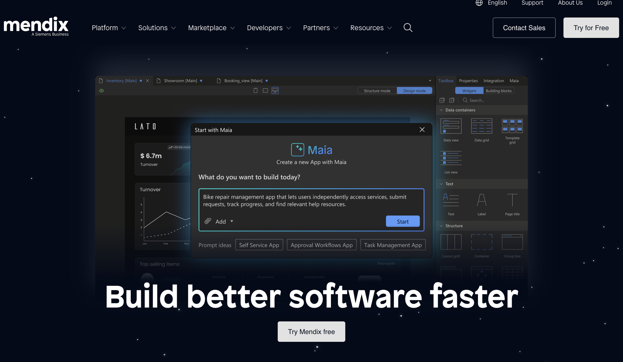
When I started working at Mendix, their homepage made no sense. “Where become thinkers makers?” It took precious seconds of scrolling before I knew what they even offered.
One of the first projects I collaborated with the web team on was restructuring and rewriting the homepage. This involved SME and stakeholder interviews, competitor research, wireframing, SEO, and writing. In my 4.5 years at Mendix, we used heat mapping and feedback to continously optimize the UX of the page, especially the above the fold experience.
Before
After
Blog Redesign
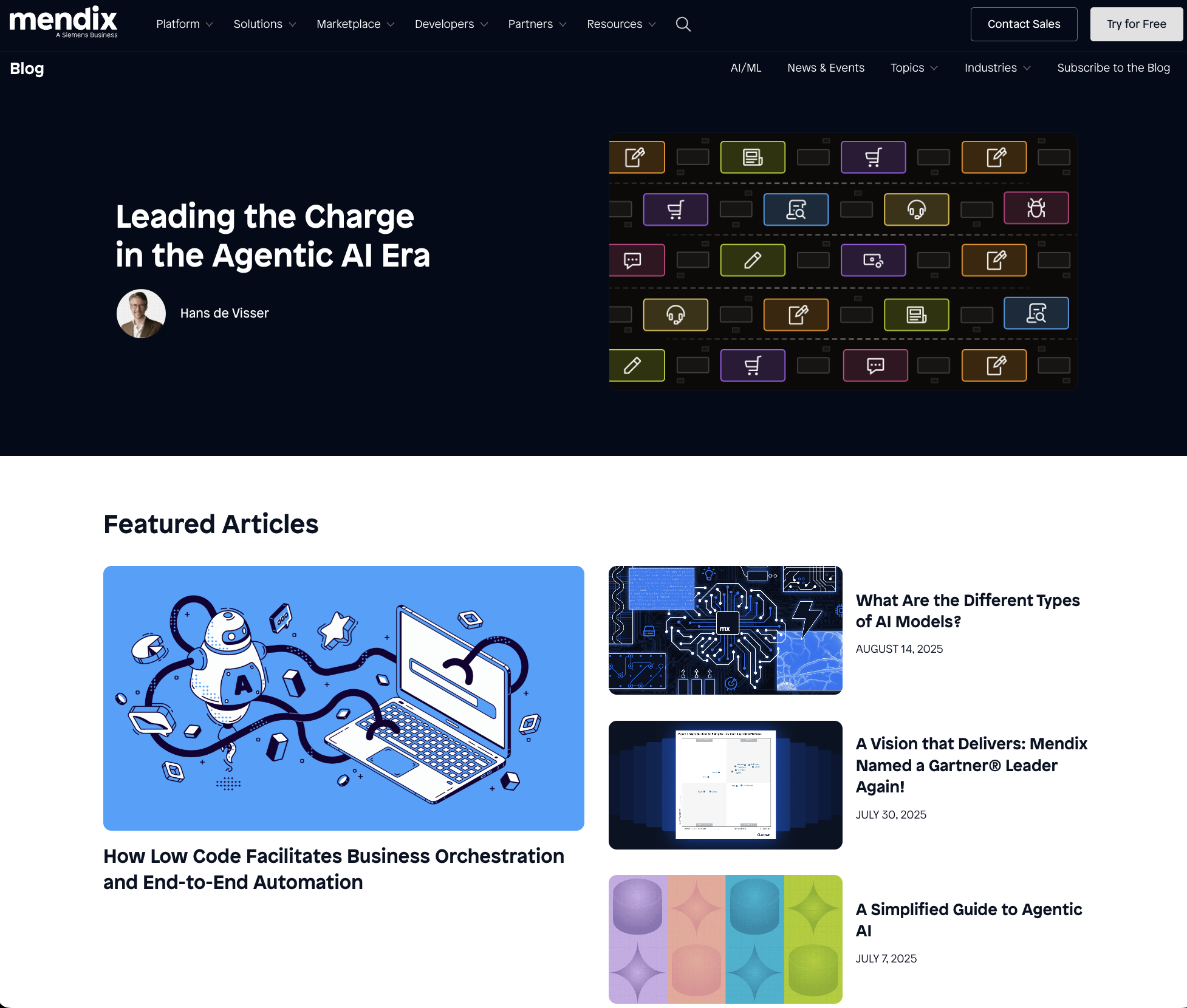
As editor-in-chief of the Mendix blog, I led the efforts for a full redesign. The old blog was crowded and outdated. Below the fold, there was an endless page scroll and no option to browse by topic. It was definitely not up to UX and SEO best practices.
For this project, I was involved in project management, research, wireframing, UX writing, feedback, and informational architecture. These are the main updates we made:
Created a blog sub navigation for clarity and easier access to different topics.
Audited more than 2,000 blog posts and created a tagging strategy for better navigation.
Removed the carousel of featured blog posts to highlight just one post (analysis paralysis avoided).
Custom-designed images for every blog post for consistency and added author images for more human-ness.
Removed clunky post summaries and optimized blog post titles to be more direct.
With the blog redesign came a new approach to our content strategy. I started a blog audit and made plans for redirecting, deleting, optimizing, and tagging every post (2,000+). Condensing the blog and updating posts with link equity led to a 90% increase in organic blog traffic in my first year at Mendix.
Before
After
Contact Us Page Redesign
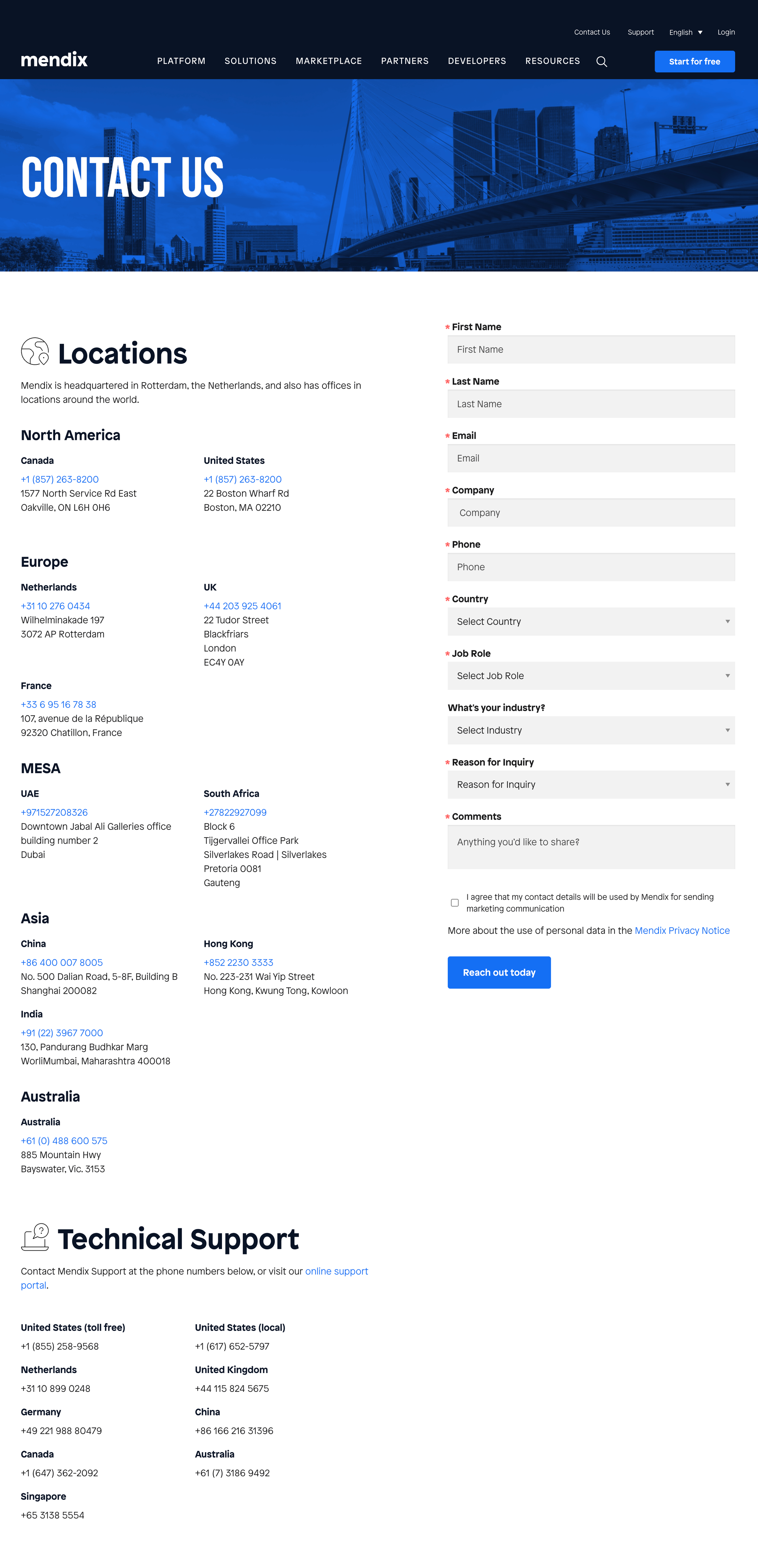
Part of my role on the web team was to optimize the UX of every page. The Contact Us page was a mess. Feedback from users told us that it was hard to know who to call and that it was unclear what the form was for. Feedback from our sales and customer accounts teams told us that users were not contacting the appropriate people for their needs.
The page needed to be explicit in its directions so users could quickly find what they need. The redesign of the page involved more visual sections with helpful links to appropriate pages, a more detailed form with directions, and an easier-to-read locations section. As soon as you land on the page, you see how to contact sales or technical support, which we learned were the two top reasons people visited the page.


